
项目过程中,开始使用了js的requestAnimationFrame方法实现进度条,但是在数据超级多的时候非常影响性能,如此改用css去实现,优化。
先贴代码:
<!DOCTYPE html><html lang="en"><head> <meta charset="UTF-8"> <meta name="viewport" content="width=device-width, initial-scale=1.0"> <meta http-equiv="X-UA-Compatible" content="ie=edge"> <title>Document</title> <style type="text/css"> *{margin: 0;padding: 0} .box{width: 100px;height: 10px;border-radius: 10px;background: #999;margin: 100px auto;border: 1px solid #ff6780;} .child{position: relative;height:100%;border-radius:inherit;} .process-animate{background: #ff6780;position: absolute;left: 0;top: 0;bottom: 0;border-radius:inherit; animation: process 1s linear forwards ; } @keyframes process { 0%{ left:0;right:100%; } 20%{ right:80% } 40%{ right:60%; } 60%{right:40%;} 80%{right:20%;} 100%{right:0;} } </style></head><body> <p class="box"> <p class="child" style="width:50%"> // child的百分比就是进度条的占比效果 <p class="process-animate"></p> </p> </p></body></html>
效果图(复制代码可查看动态效果):

正常情况下,百分比肯定是根据后台数据进行计算得出的,所以是动态传入的,下面贴vue代码
进度条子组件(progress.vue):
<template> <p class="process-wrapper" :class="{'addGray':addGray}"> <p class="process-child" ref="processChild"> <p class="process-animate" :class="{'addGray':addGray}"></p> </p> </p></template> <script>export default { props: { addGray: { //置灰 type: Boolean, default: false }, progressWidth: { //进度条百分比 type: Number, default: 0 } }, mounted() { this.$nextTick(() => { console.log(this.addGray, "addGray---"); this.$refs.processChild.style.width = this.progressWidth + "%"; //动态改变进度条 // this.$refs.processChild.style.width = 90 + "%"; 测试效果 }); }};</script> <style lang="scss" scoped>.process-wrapper { width: 1.98rem; height: 0.13rem; margin: 0.12rem 0 0.1rem 0; border-radius: 0.1rem; background: #fff; border: 0.01rem solid #ff6780; &.addGray { background: #999; border: 0.01rem solid #999; } .process-child { position: relative; height: 100%; // width: 100%; //这个width就是动态变化。通过js改变 border-radius: inherit; .process-animate { background: #ff6780; position: absolute; left: 0; top: 0; bottom: 0; border-radius: inherit; animation: process 1s linear forwards; &.addGray { background: #999 !important; // border: 0.01rem solid #999; } } }} @keyframes process { 0% { left: 0; right: 100%; } 20% { right: 80%; } 40% { right: 60%; } 60% { right: 40%; } 80% { right: 20%; } 100% { right: 0; }}</style>
父组件调用:
<!-- 进度条 --> <Progress :addGray="inactive" :progressWidth="progressWidth"></Progress>
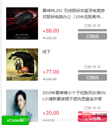
看看实际效果:
推荐教程:《CSS教程》
以上就是css3 如何实现进度条效果的详细内容,更多请关注24课堂在线网其它相关文章!